Logo Animations
Behind this project is a conversation about expanding the idea of a logo animation. There are three concepts for a logo: A visual short, an awards package, and a short but sweet tech logo. Each logo had to be conceptualized and executed in 5 days, including collaboration with a sound designer.
Year: 2023
Role: Designer and Animator
Time: 2 Weeks
Sound Design: Jude Wade
Year: 2023
Role: Designer and Animator
Time: 2 Weeks
Sound Design: Jude Wade
Particle Systems
I incorporated a particle system and tracer to create organic stands within the gold. By using a field force and noise, I was able to manipulate the stands to create fluidity for an elegant motion language.
Lighting
To light the Oscars logo, I used a gobo mixed with noise as an alpha on the light source. This helped achieve a balanced mix of darks and whites for the metallic finish. I quickly found that a 3-point lighting setup wasn't going to work, so I lit individual letters with their own lights. This helped create precise and tailored lighting for each letter, allowing me to get a perfect rim light on each.
Nickelodeo Logo
If creating a branding look for the Oscars wasn't enough in 5 days, the next 5 days were dedicated to character animation. Drawing inspiration from the 90s Nickelodeon cartoon "Pinkey and Brown," I modernized the characters, redefining their world in Redshift and Cinema to capture the essence of the original series with a fresh look.
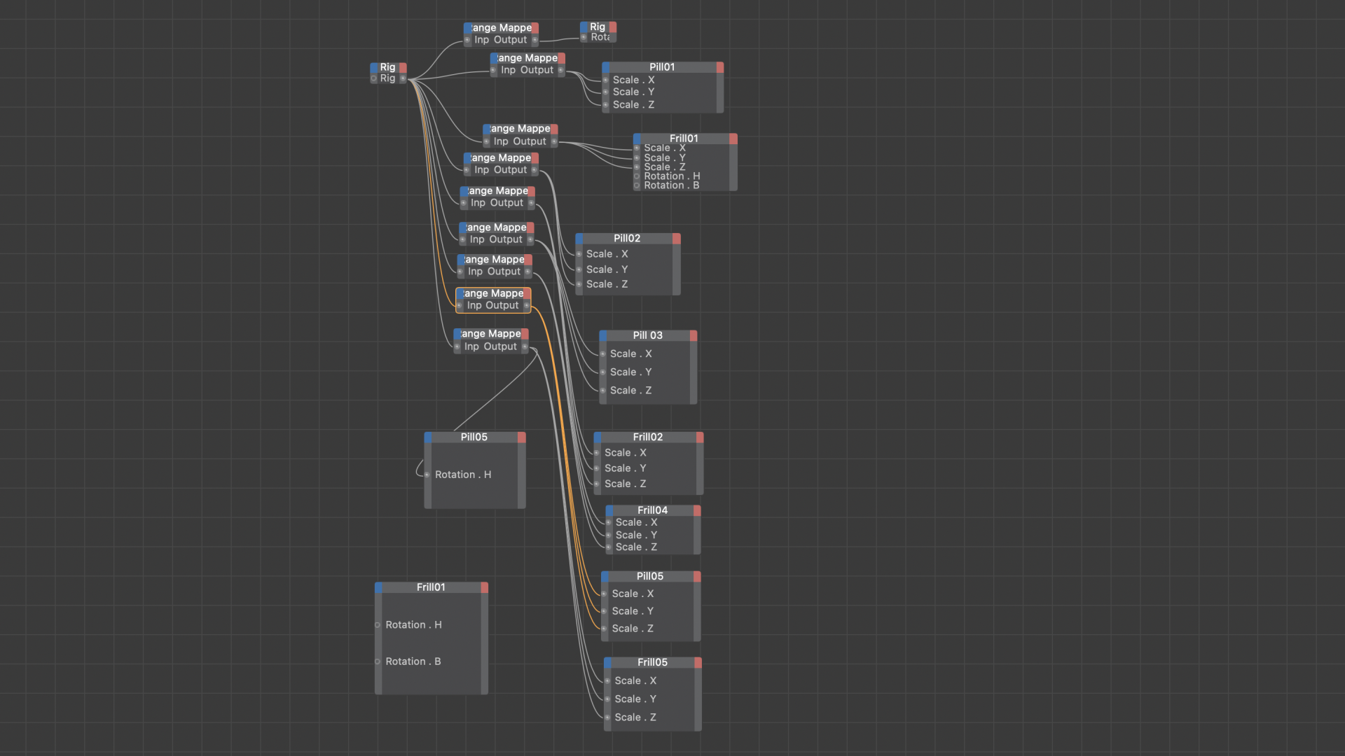
Charecter rigging
The main creative constraint was creating each logo within a 5-day deadline. The characters needed to be rigged quickly but still be complex enough to control 4-6 parameters together.
From then, it was time to dive into easing, making sure everything felt organic and handmade.
Texturing
This piece relied heavily on texturing, so I made sure to allocate a significant amount of time to crafting a Redshift texture resembling clay. I animated the seed of the displacement map every 5 frames to achieve a distinctive "boil" effect—integral to the stop-motion look.

Slack
One can dance around the idea of a logo animation, but at the end of the day, it's time to get traditional. In 2-3 seconds, popping out of the page. Once again, I worked in Cinema to create a 3D environment for a classic 2D logo. The colors of Slack have always played, so I wanted both logos to embody that sense of organized creative freedom.
XPresso
The two Slack animations arose from a need to invest time in learning Xpresso. Both logos were built as rigs; I crafted the animation beforehand and then dedicated time to easing the sliders to perfect the motion.