CoMotion 2024
CoMotion is the largest student-led motion design conference in the world. Motion Media Design students at the Savannah College of Art and Design participate in a two-day event to engage and learn from over 35 companies.
Every year, two students are awarded the opportunity to rebrand the event. They are in charge of recruiting and leading a team of 40, overseeing production on 100+ deliverables, including a 3-minute title sequence introducing the event.
On October 16th, alongside my good friend Muskaan Sethi, we were awarded the opportunity to brand CoMotion.
Year: 2024
Role: Creative Director
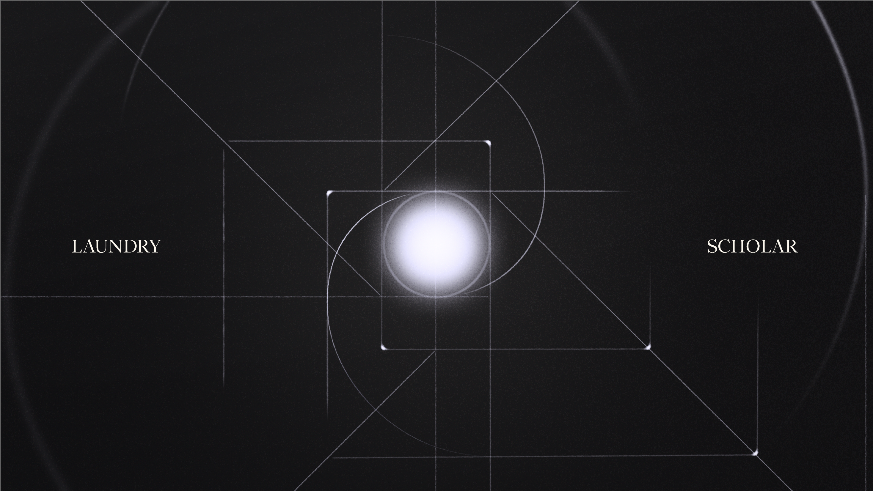
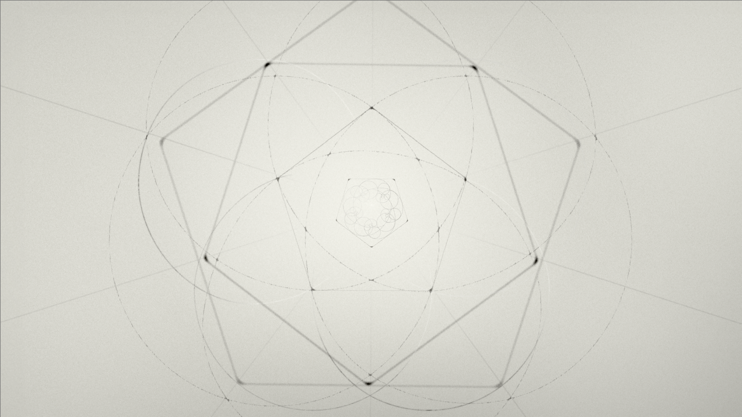
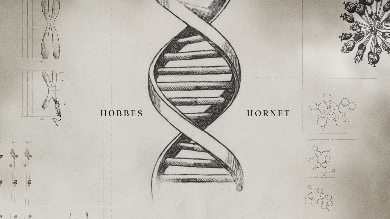
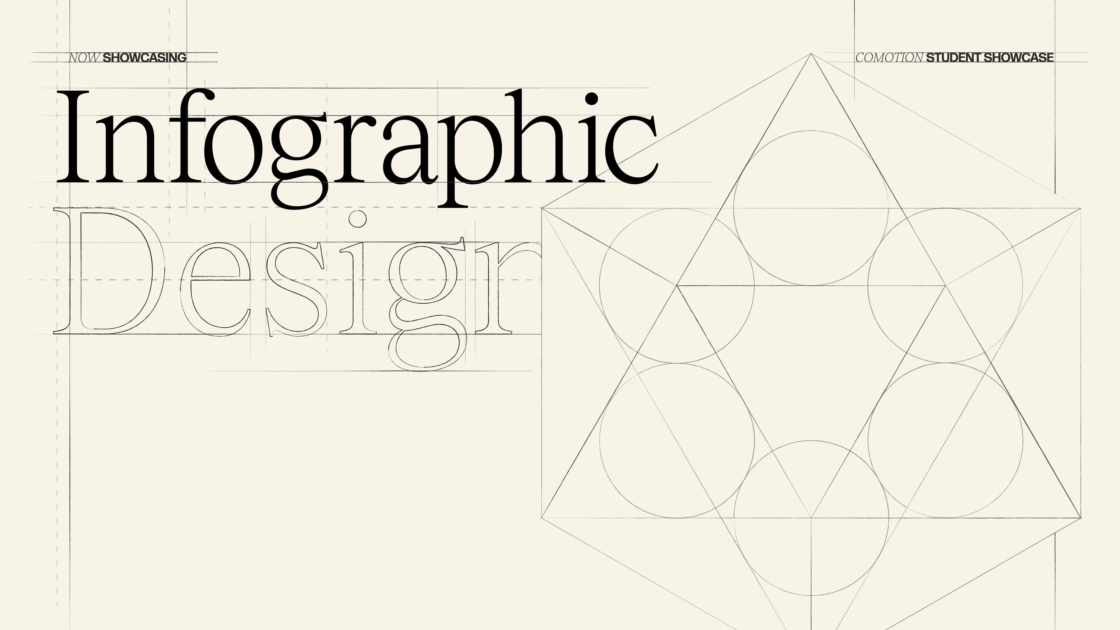
Logo Design
Designed by Muskaan Sethi, Kyle Switzer
Animated by Kyle Switzer
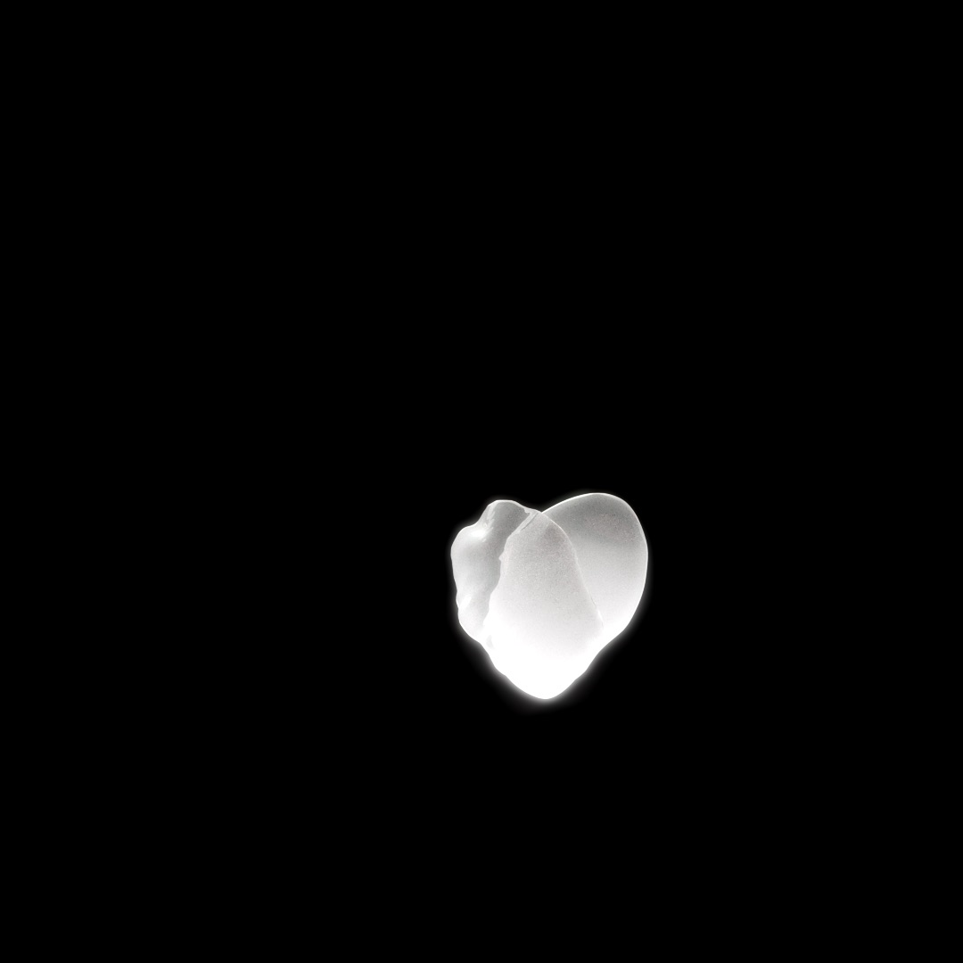
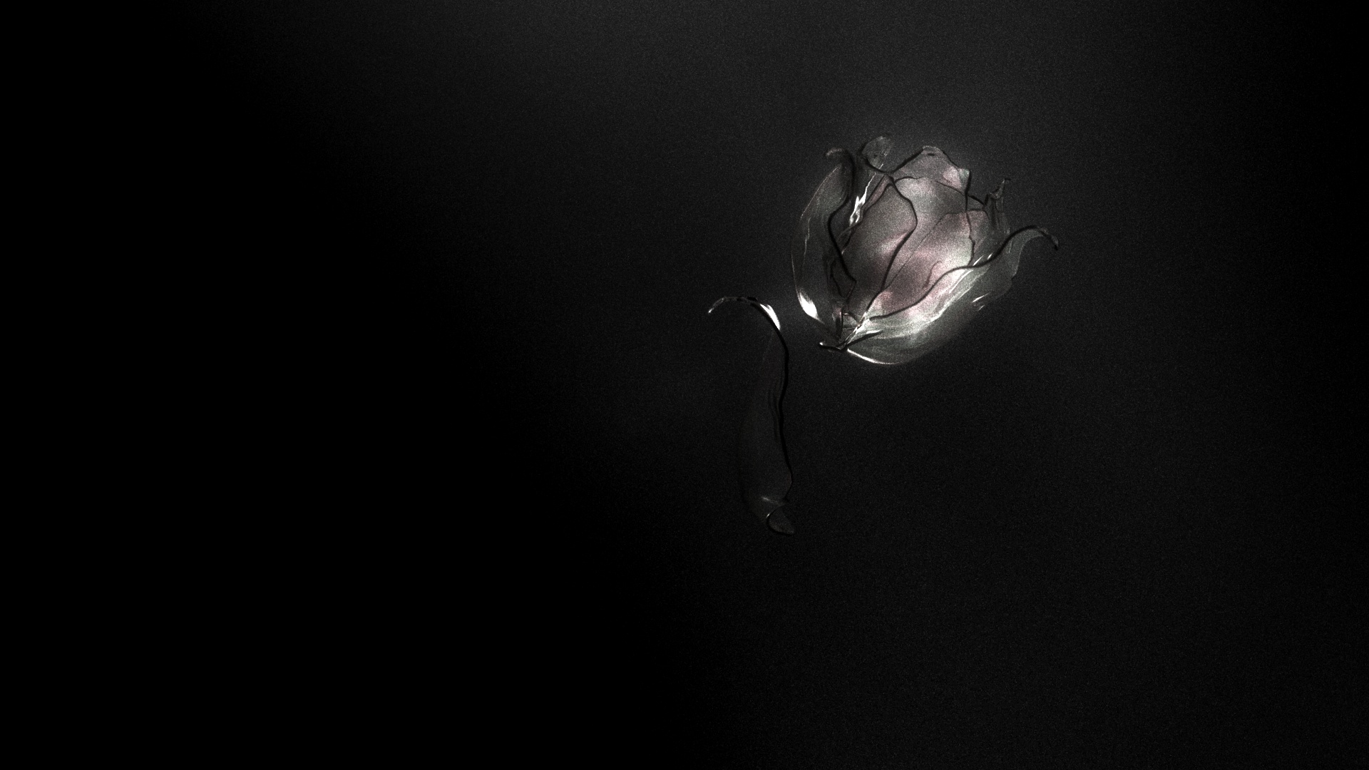
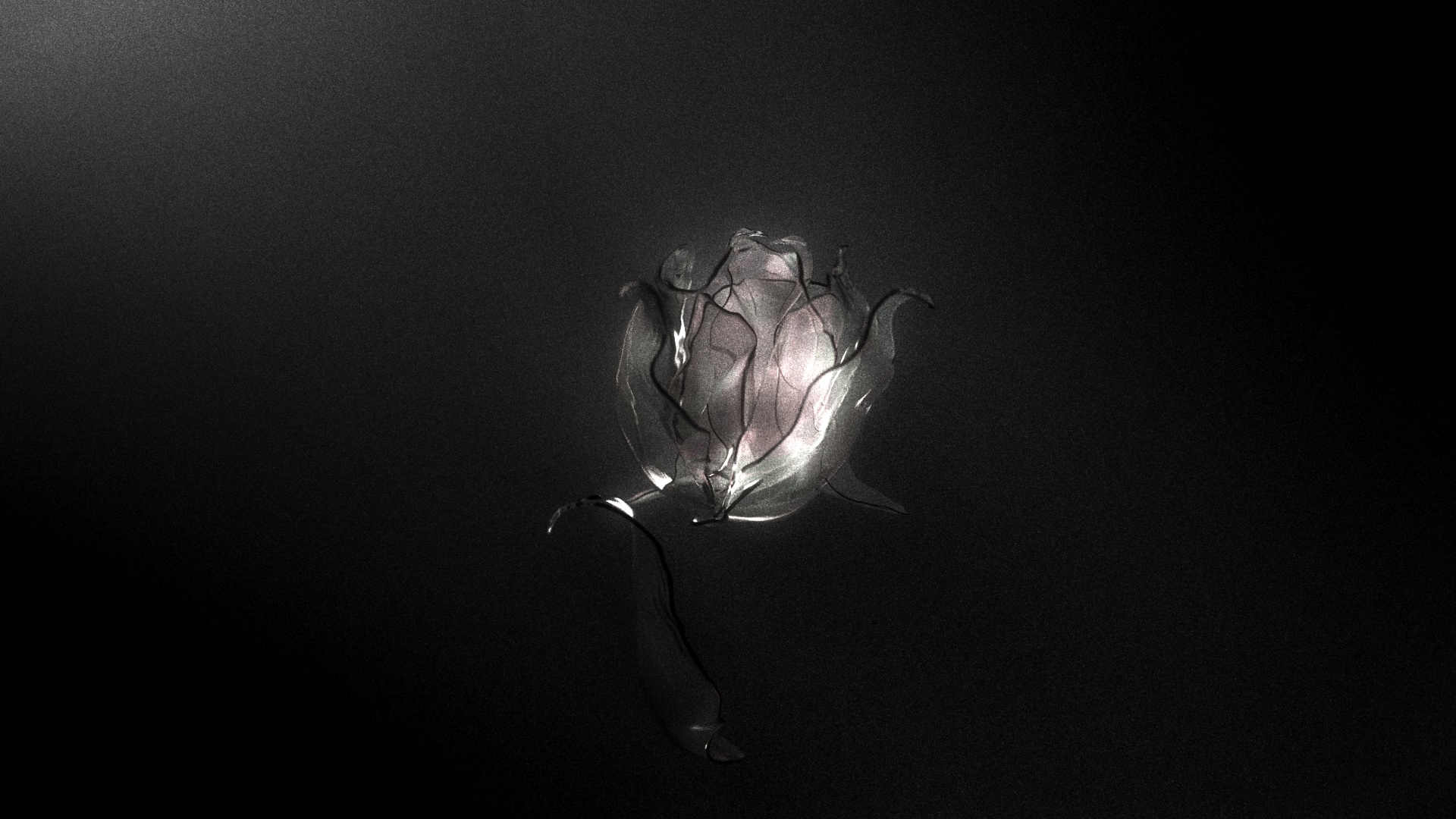
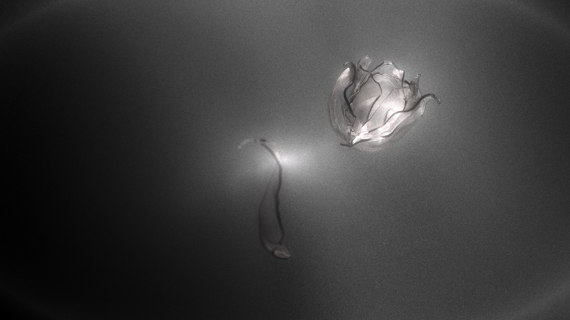
Muskaan and I knew we had to craft a logo that captures the essence of process—something so essential to an education in design—while remaining true to our organic design language.
Moving into animation, I aimed to not rush to the final look, but guide viewers through the process of creating the letter forms. We looked to Roman type anatomy as a starting point for the design, and that exploration continued as the primary direction for animation.


The Pitch
Over a three-week period, Muskaan and I worked diligently to craft a pitch for branding CoMotion 2024. Competing with 13 other pitches, we understood the necessity for ours to be original, rooted in concept rather than style. The pitch needed to feature strong 3D elements while prioritizing 2D frames to appeal to all facets of motion designers.
On October 16th, we were honored with the title of creative directors, initiating the process of assembling a 40-person team to bring our idea to fruition.
All frames below designed by Kyle Switzer


Design Process
Lead: Tiffany Tedy
Designers: Evian Liao, Phyllis Zhao, Haze Nguyen, Danna Macias, Sarah Wellman, Chaoran Xu
Over a 10-week span from December to January, we commenced the production of our title sequence with design. To enhance collaboration, I shifted our meetings from weekly to biweekly, introducing mid-week sessions for work-in-progress reviews and questions.
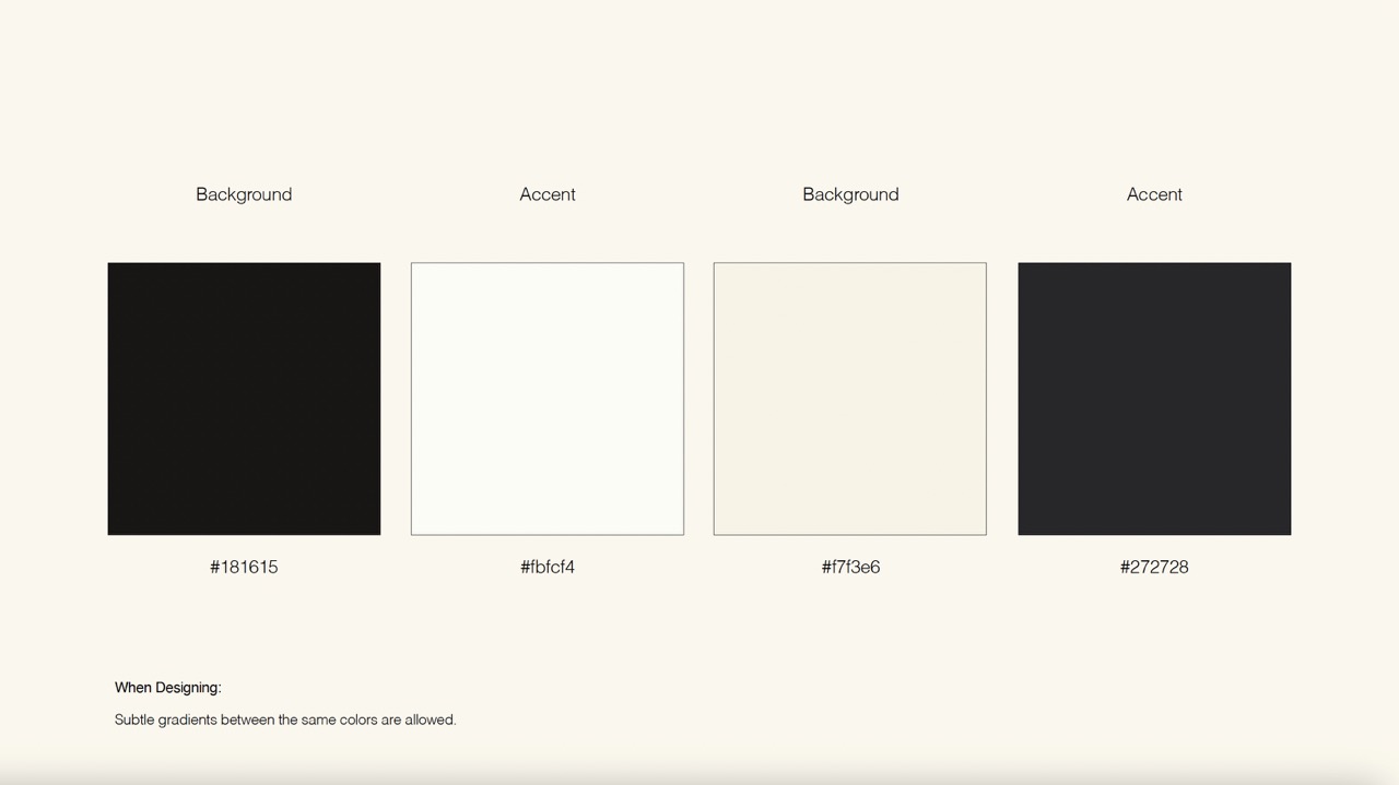
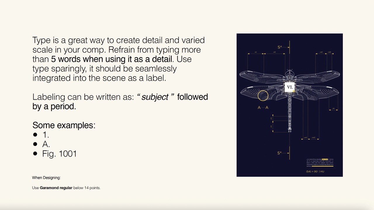
Muskaan and I kicked off the process by writing a design guide—a 50-page booklet offering clear creative direction and constraints. Recognizing the value of a coheative brand guidline, we encouraged our designers to embrace creative freedom within those constraints.

Design Deck
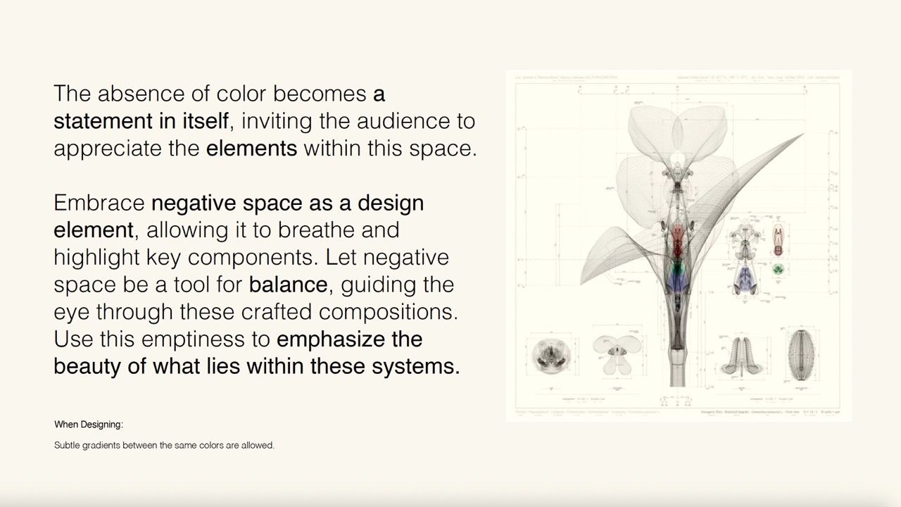
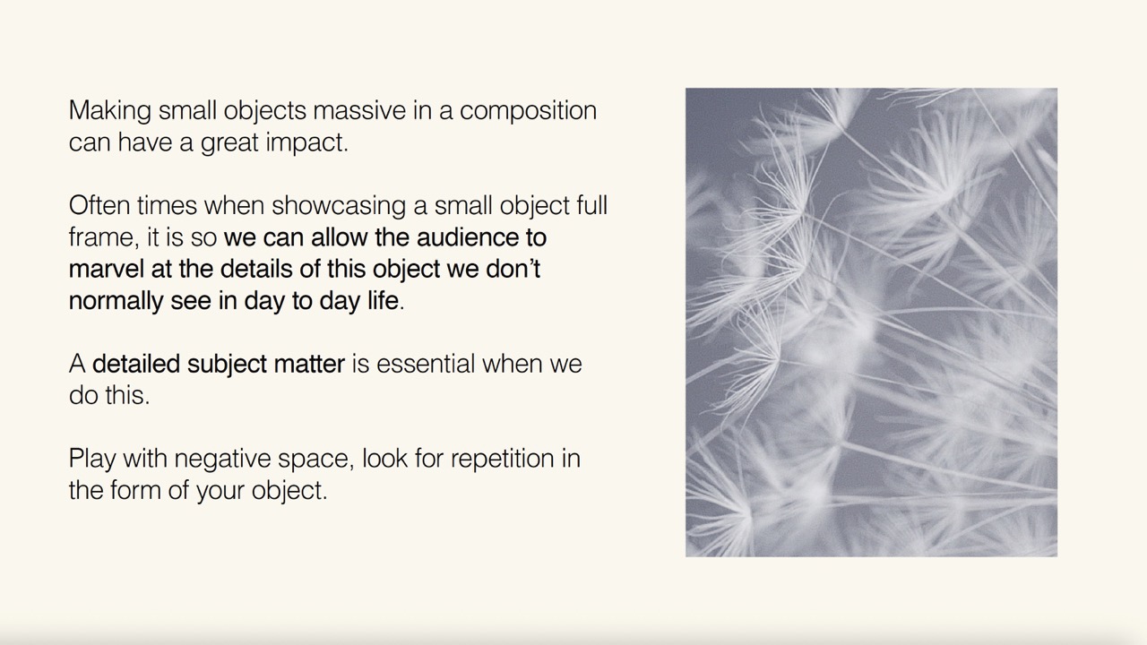
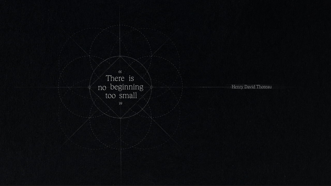
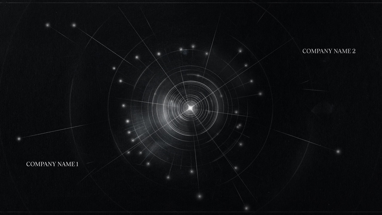
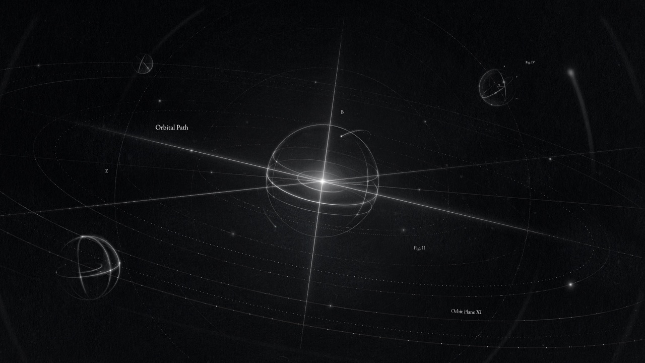
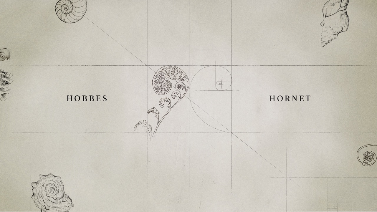
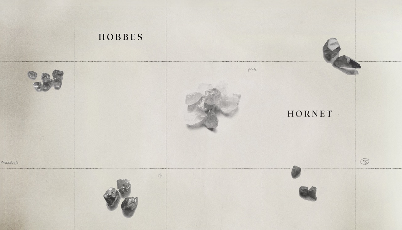
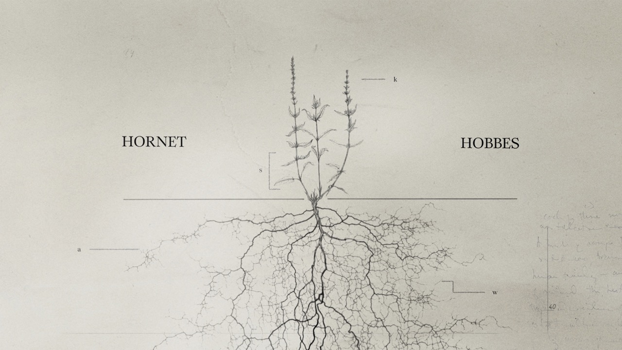
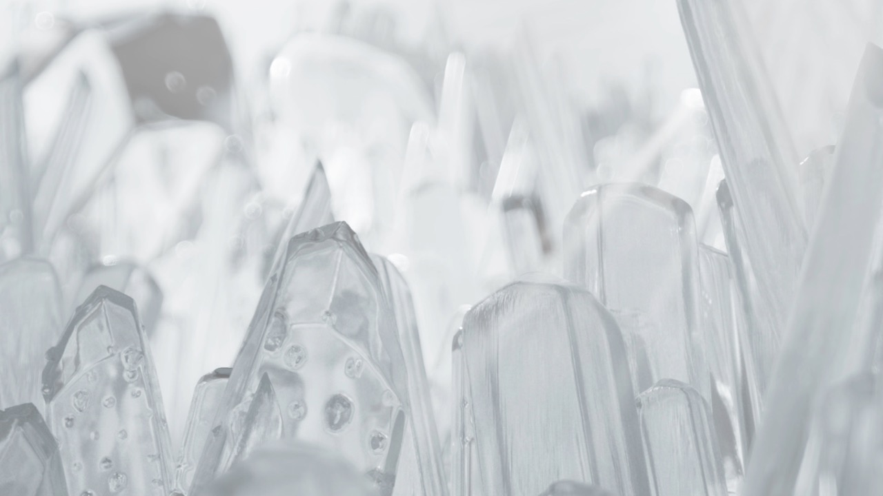
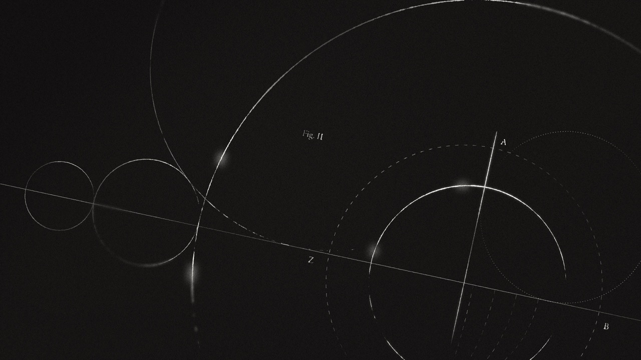
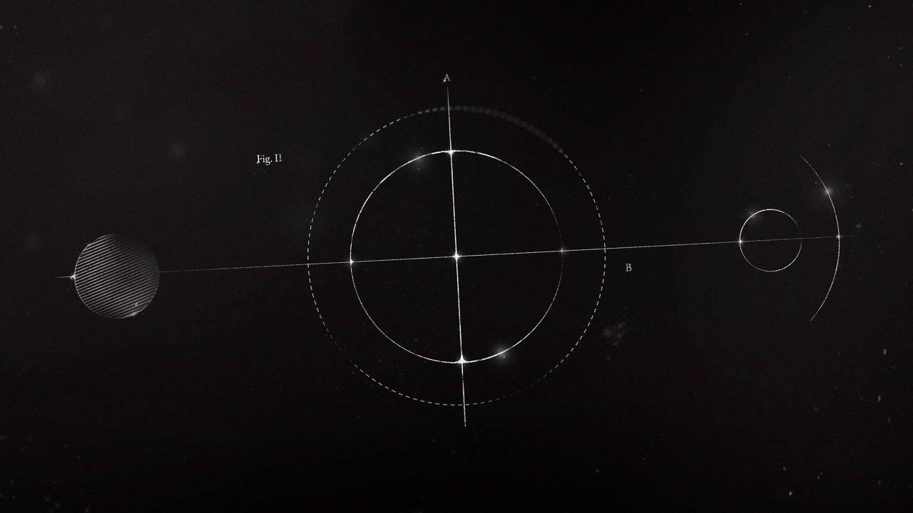
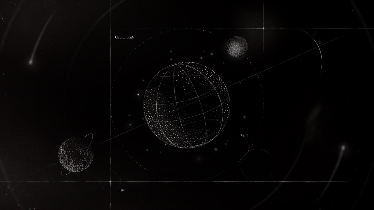
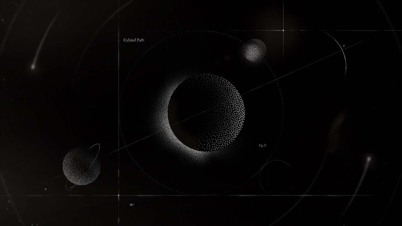
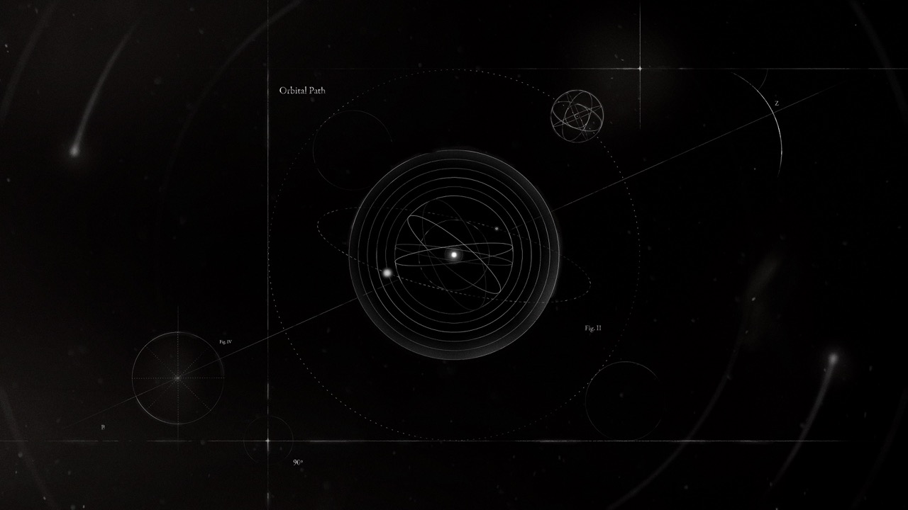
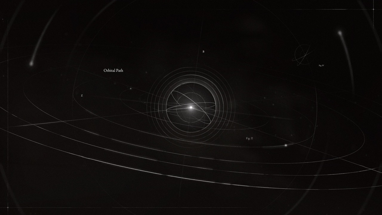
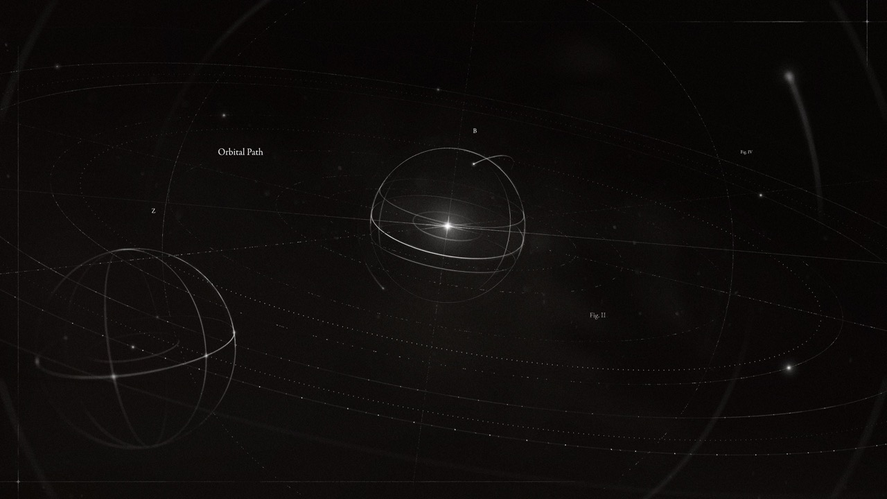
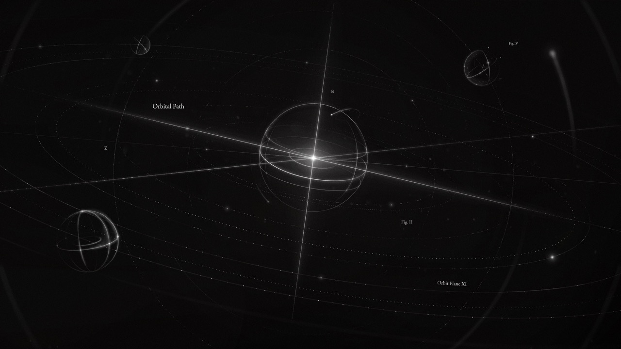
How do we ensure the audience feels they're not just observing life, but embarking on a journey to study it? We meticulously addressed scale, magnifying the microscopic, then confining the expanse of space into a frame.
Motion design has such a unique ability to show life through abstraction—can we do that? How might we depict atoms, their splitting and joining, in a way that feels fresh and new.
When we strip away the veneer of color what remaigns?

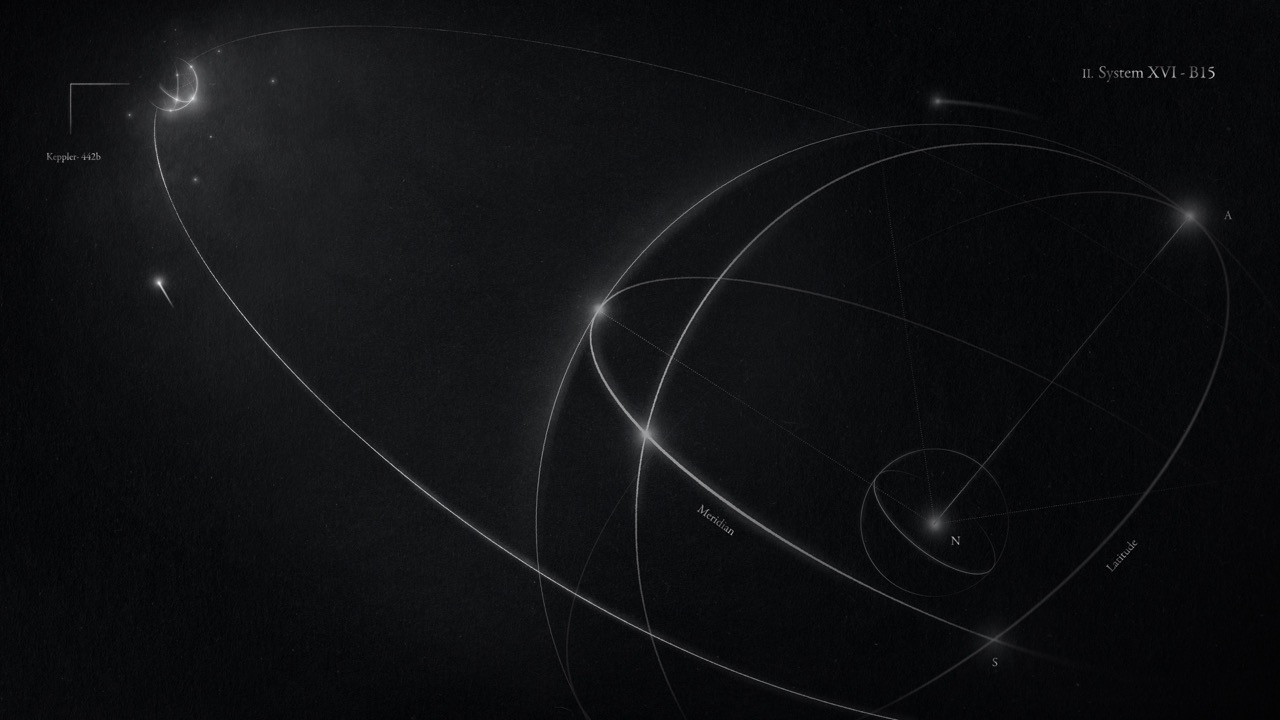
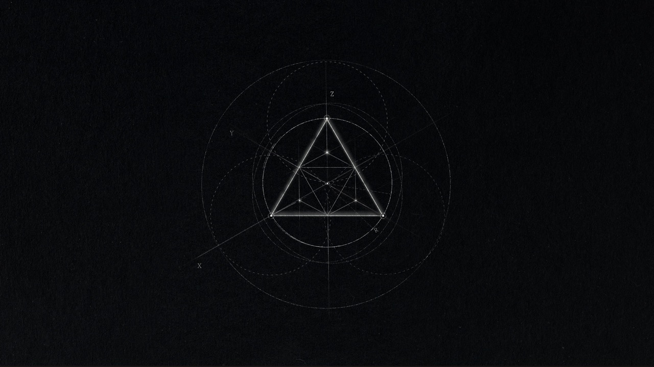
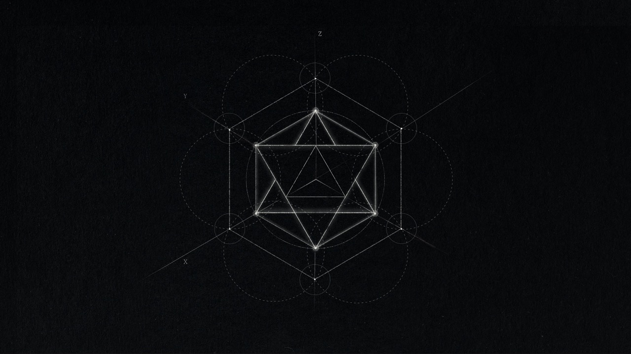
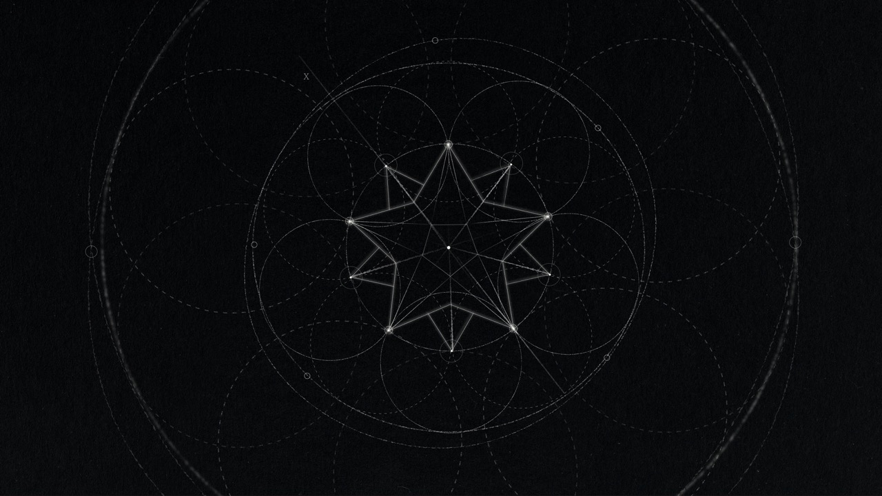
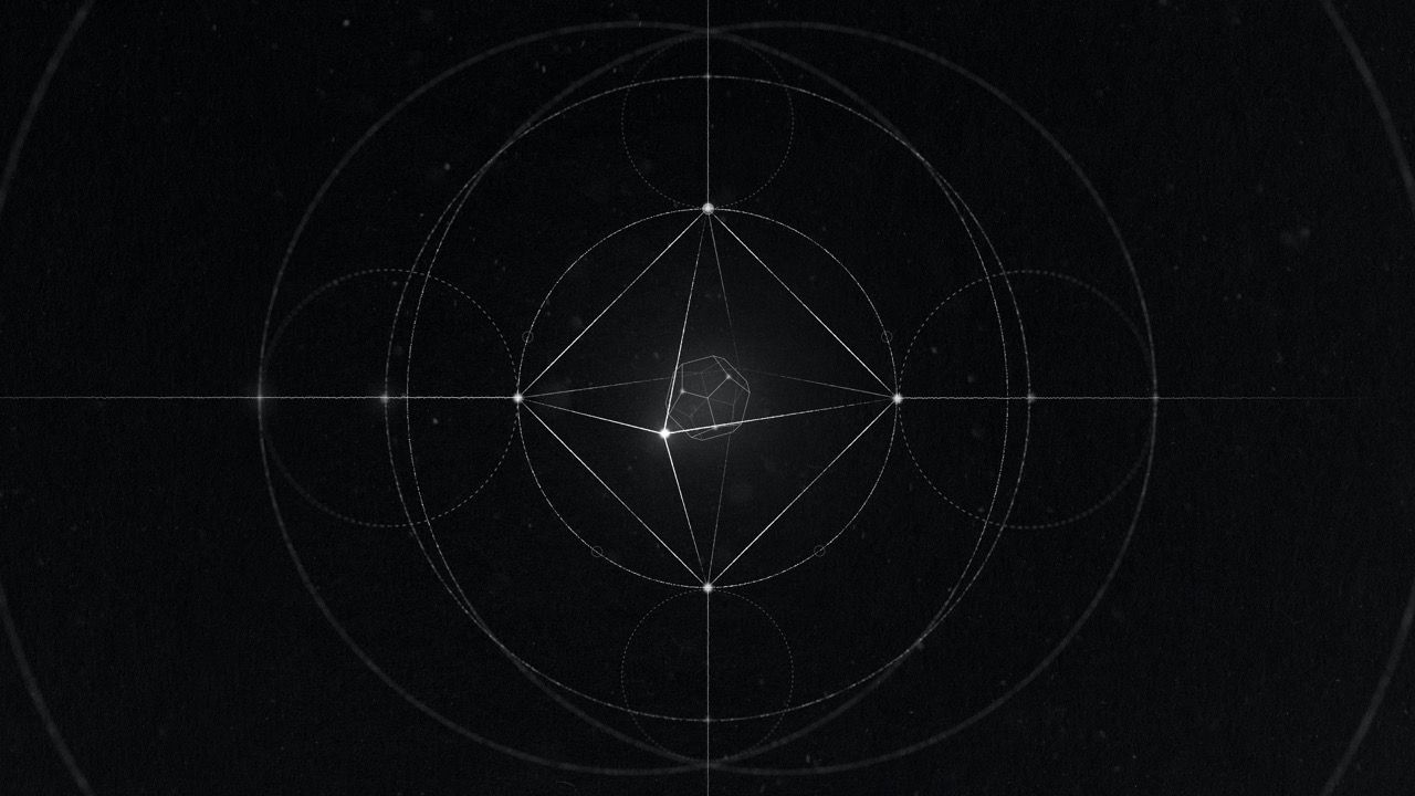
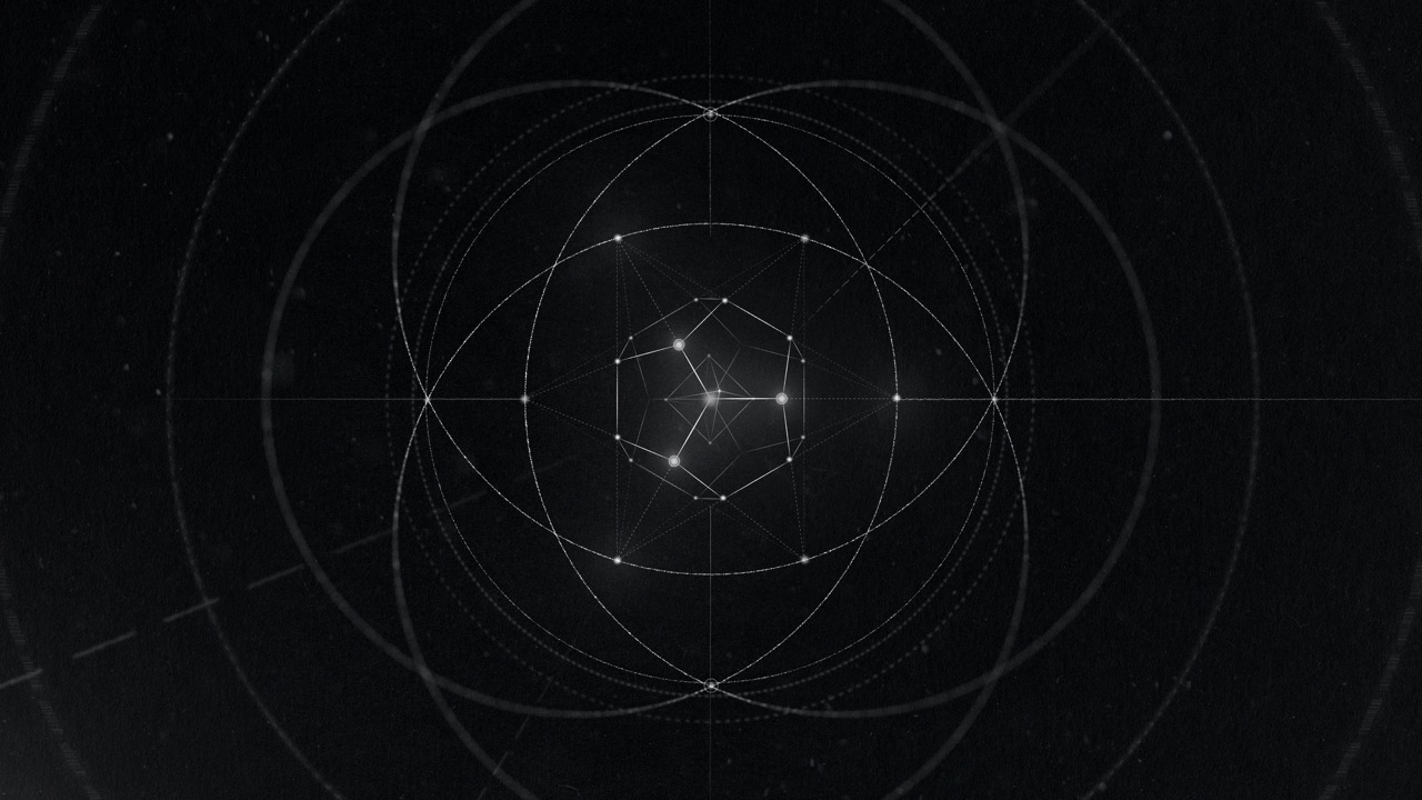

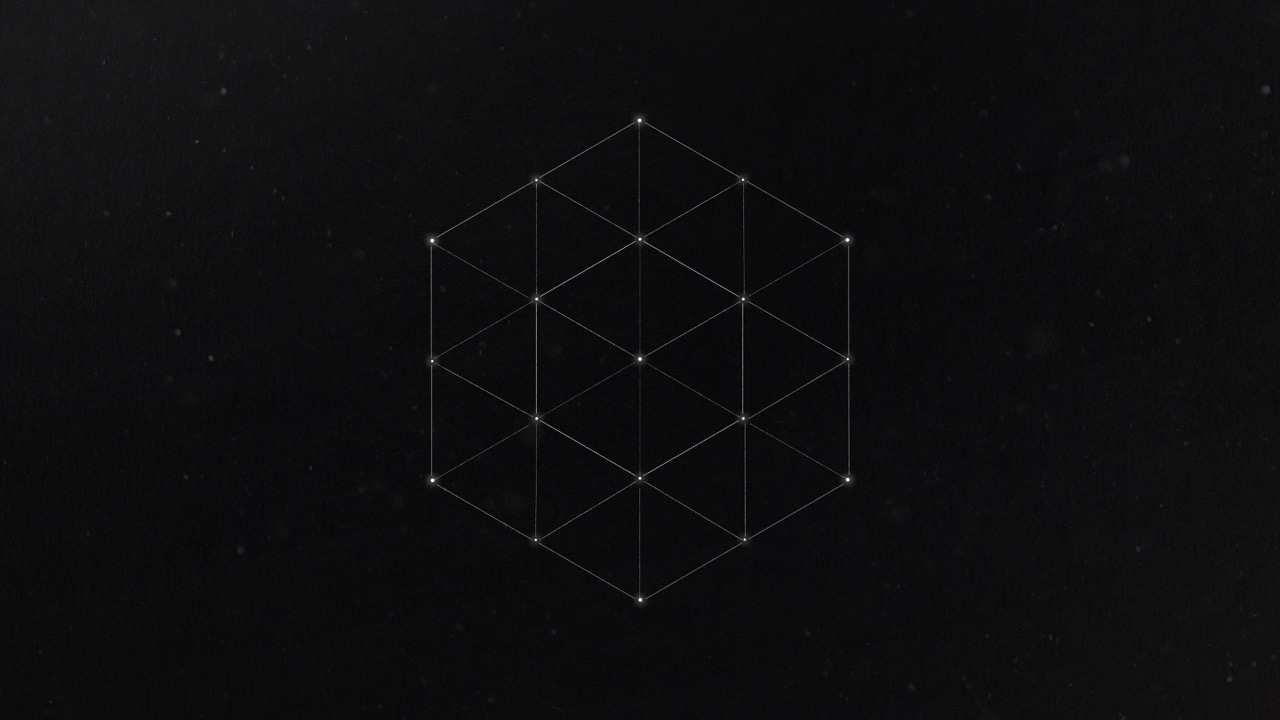
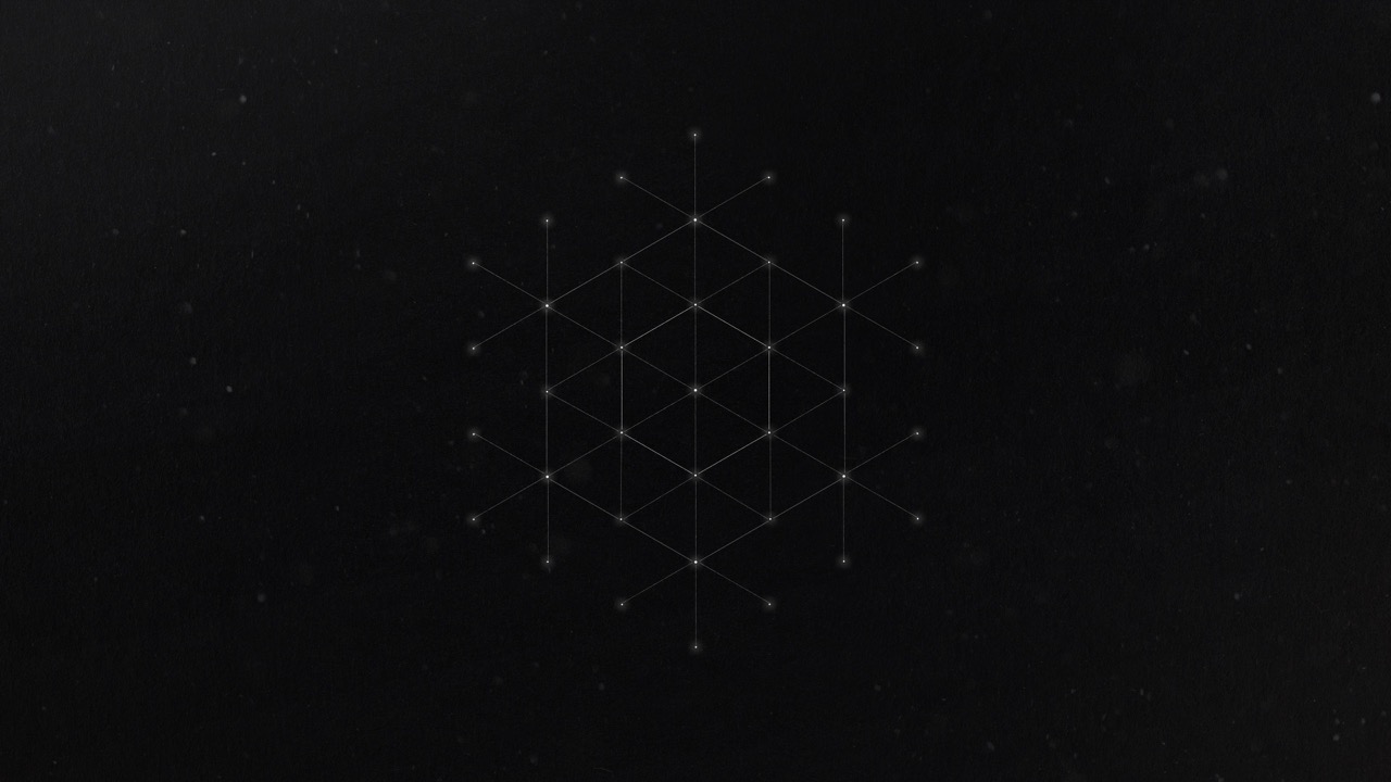
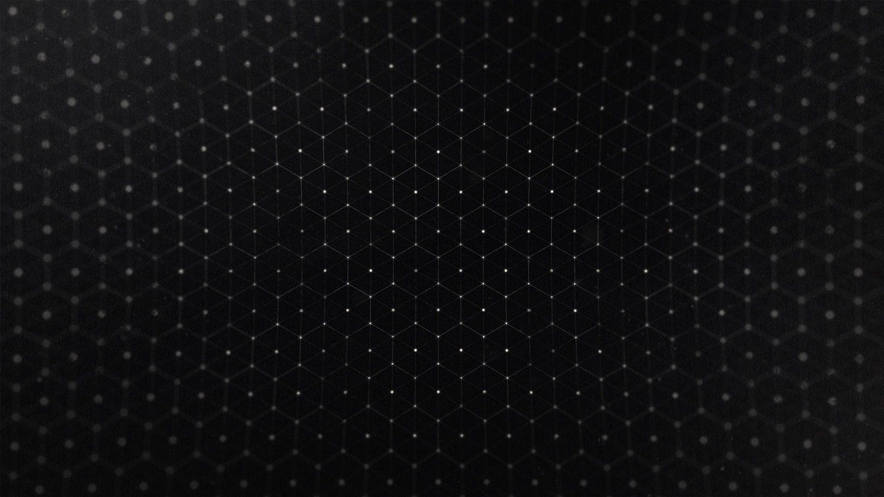

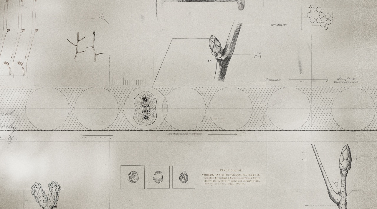
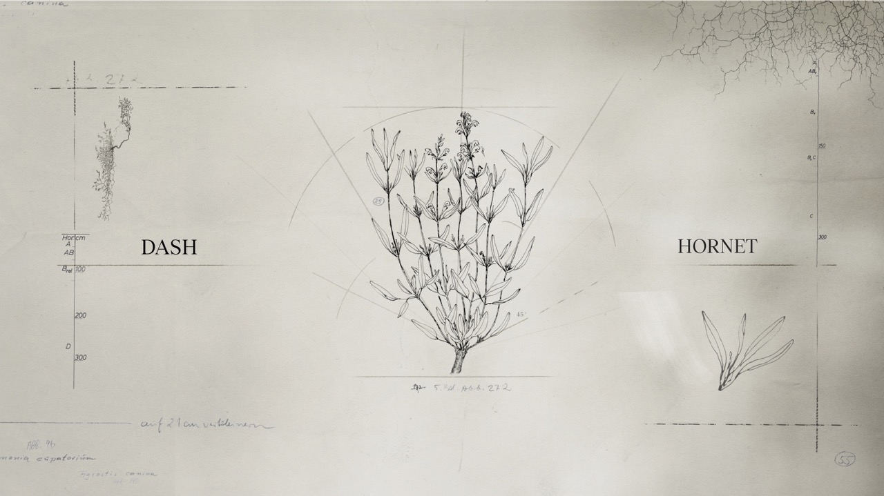
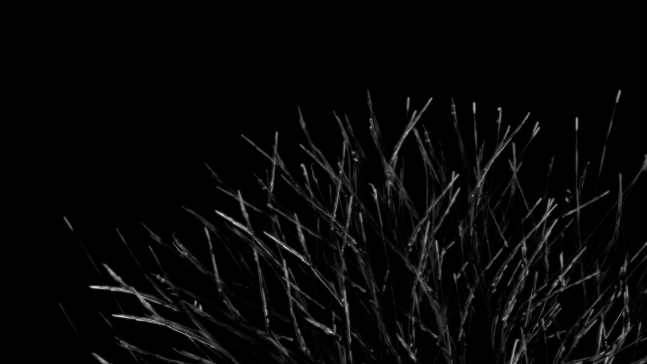


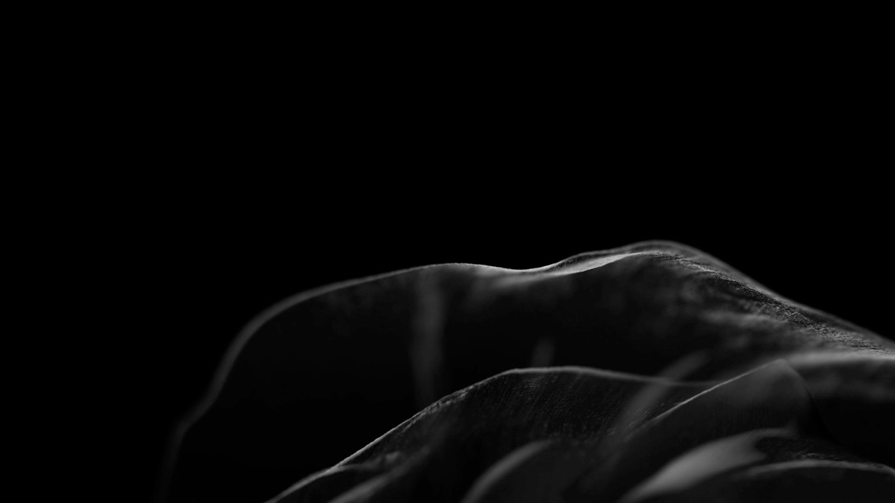
Pushing depth in frames
The Comotion design system draws from scientific diagrams, mostly inspiration from a 2D world, because of this our first drafts leaned heavily towards a flat look.
Drawing upon my expertise in 3D animation, I encouraged our designers to explore depth within the scenes while remaining true to our design language.
Design process: Danna Macias
Graphic Design System
Lead: Reem Hinedi
Designers: Aatreyi Singh, Alessia Piccoliori, Charlotte Beck, Claire Lin, Emily Strycharz, Gauthier Bossuyt
One of the main initiatives I spearheaded from the outset was to run our branding system with a professional typeface. We looked at several options but ultimatly we secured funding, and purchased “Tobias” by Displaay Type Foundry.


Title Cards Version 1


Big type, more negative space, room to breath.
During the initial stages of CoMotion, a recurring challenge surfaced with designs appearing derivative from last year. This demanded quick initiative realign toward a new direction, while maintaining our production schedule.
I pushed the team to work with more negatice space, and relay on the type as the primary compostional subject.


SH_01-SH02
Animated by Kyle Switzer
I encouraged the directors to animate a shot of the sequence, ensuring that we weren't merely issuing orders but were actively engaged alongside our animators—working in the trenches with them.
Given that this shot demands technical proficiency in our branded type animation and 3D, I took this one. I also believed it was appropriate for me to personally introduce the sequence.


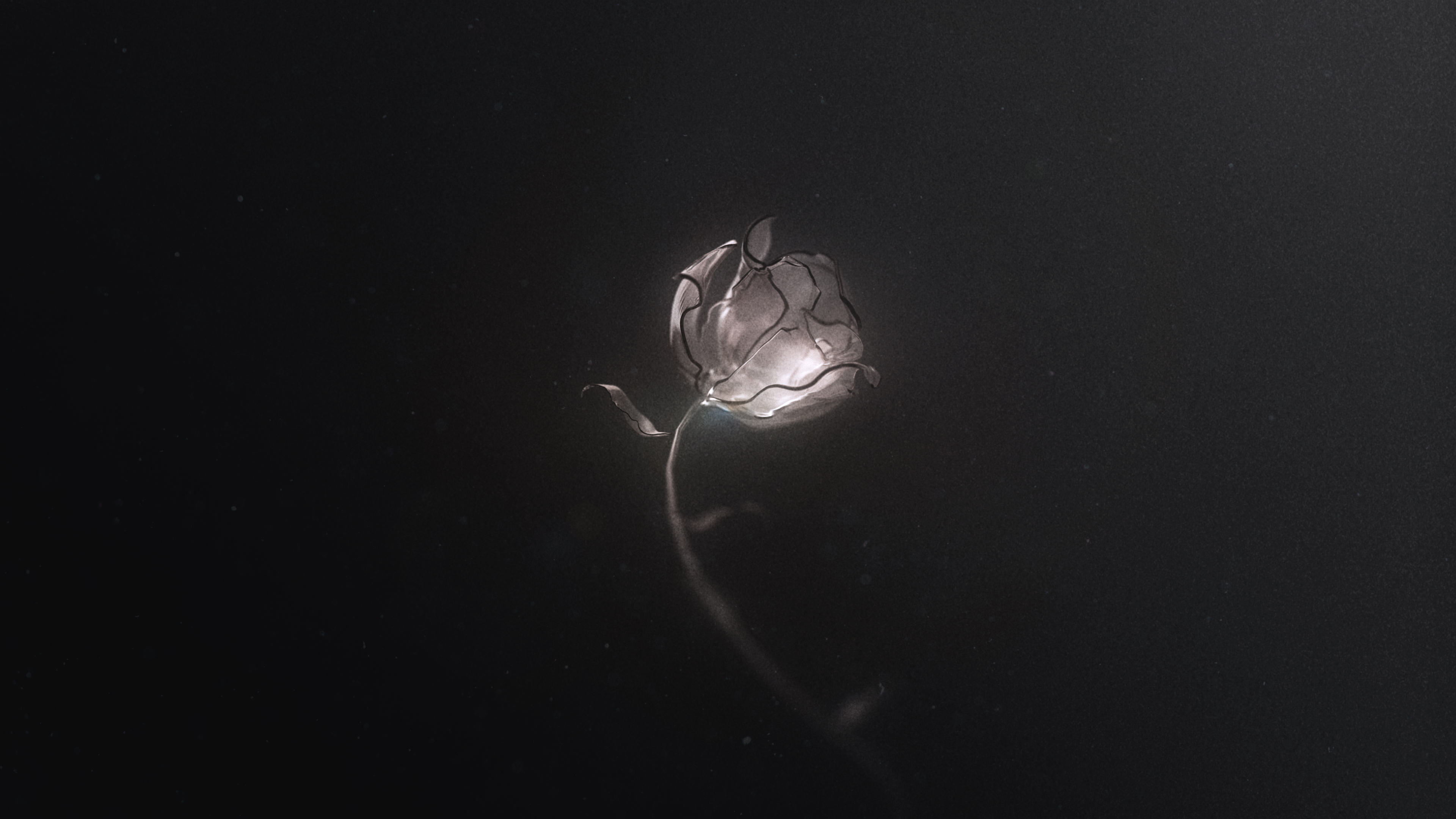
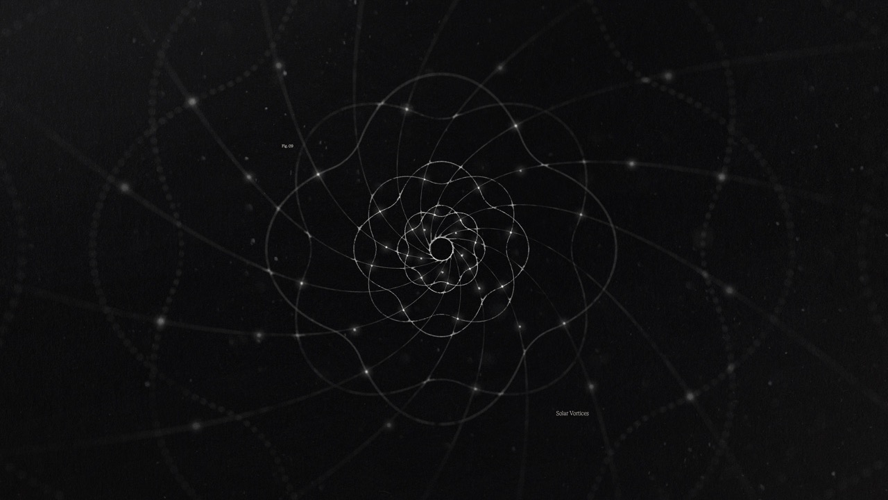
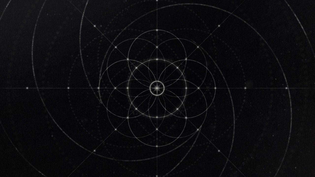
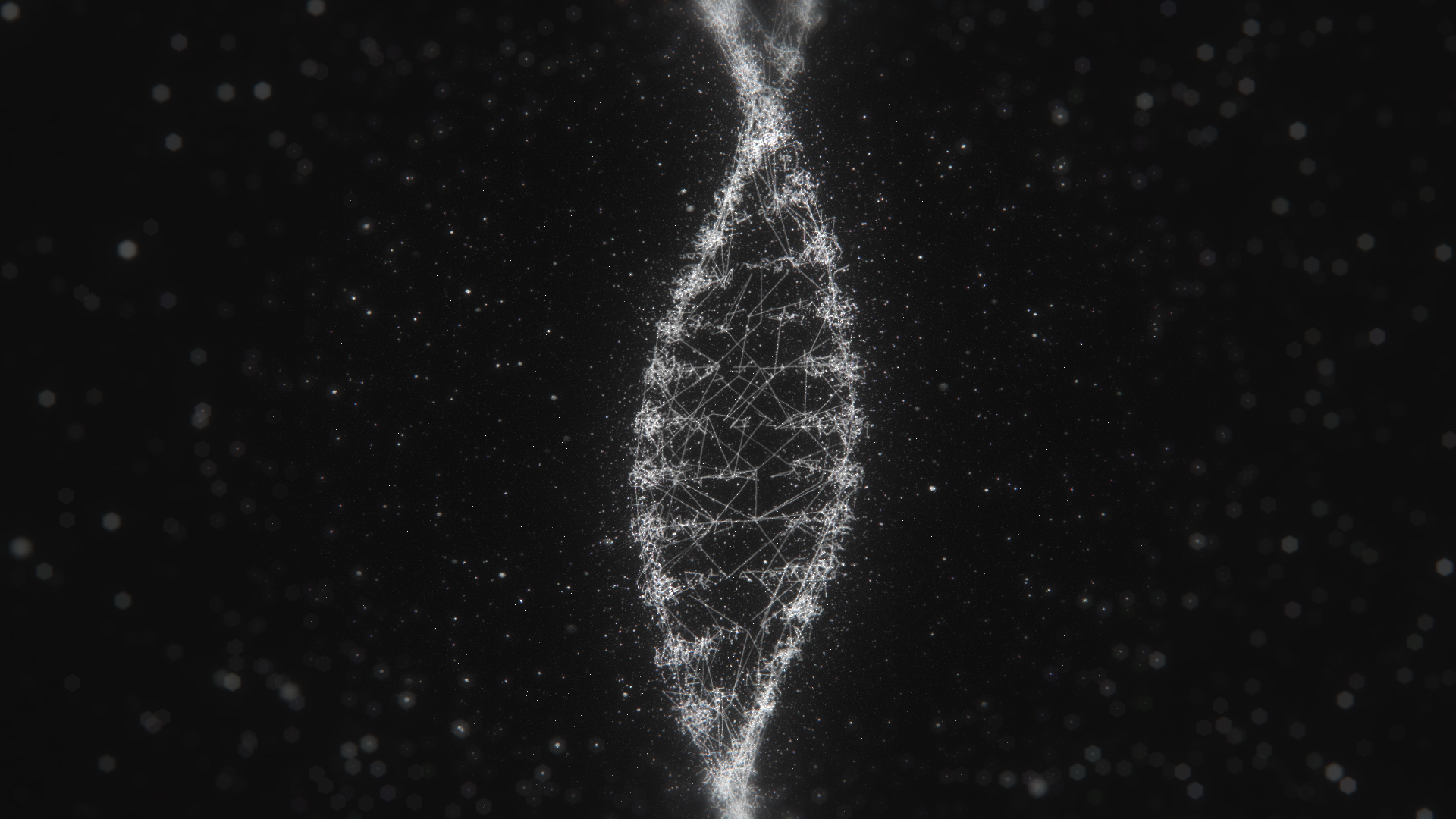
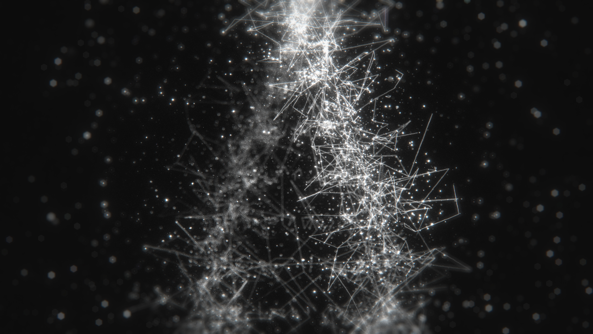
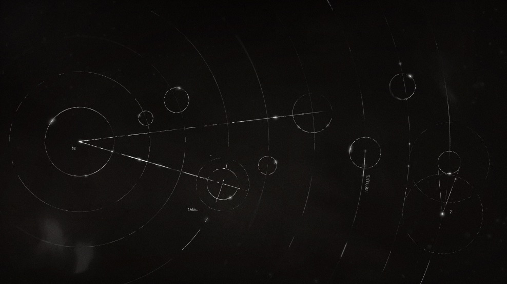
Creating Organic motion in 3D
The CoMotion 2024 title sequence depends on lines and dots as its central compositional element. I ensured the initial sequence began minimally—introducing a solitary line and dot as an opener as a way of gently guiding into the world of CoMotion.